I’ve been giving some thought recently to overhauling the BOINC Manager user interface.
The original GUI was a carry over from an MFC based version of BOINC Manager that was created even before I was hired on as an employee. The original didn’t even have the buttons off on the left hand side, the user would have to have guessed that they could right-click on something to bring up a context menu.
So, here we are four years latter and we are talking about adding more tabs to an interface that is already overly complicated.
My goals were as follows:
Disclaimers:
If there is interest in the community to see something more formal I will go ahead and spec it out and submit it for review.
Initial Install
After a clean install, the client area should display a quick blurb that BOINC in and of itself is just a task execution engine and needs to be attached to a project/account manager before it can actually process work.
At the bottom of the blurb should be an attach to project and attach to account manager link.
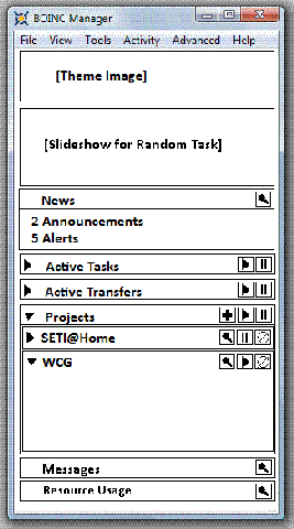
Working User Interface
Clicking on
In the mock-up on the right hand side the ‘News’ section would disappear unless there are new news items. The news section is supposed to be a summary roll-up of various RSS feeds for each of the projects. It would also contain messages generated in the messages area for things like disk space warnings and the like. Another possible use for it would be the number of new messages for a thread you are watching in a projects forums.
Active Tasks, when expanded, would list the active tasks on the system in the format:
<Project Name>:<Task Name>:<Percent Complete>:Suspend:Resume:Abort
Active Transfers, when expanded, would list the active transfers on the system in the format:
<Project Name>:<Transfer Name>:<Percent Complete>:Suspend:Resume:Abort
Both <Task Name> and <Transfer Name> would be truncated and an ellipse (…) added in the case where the names are to long for the display area.
Projects, when expanded, would list the projects the client is attached too.
Each project, when expanded, would have a section for the following areas:
The main window should have a vertical scroll bar for when everything is expanded, but it should not have a horizontal scroll bar.
—– Rom
[Update 28/08/2008 9:37am]Apologies to Michael Tughan, while I can’t recall seeing his designs for a Mac specific GUI it doesn’t mean I didn’t. I don’t know how much overlap there is, but I thought I had drawn my inspiration from a combination of Outlook 98, MSN Messenger, and Yahoo Messenger.
This post was last modified on December 17, 2020 3:18 pm
2020 turns out to be a hardware refresh year for ROMWNET. I've upgraded the network…
After a bit of research and experimentation, I figured out how to fix my permalink…
After a seriously long time, I've finally upgraded my blogging platform to WordPress. Dasblog was…
Original post: New BOINC Manager Design Project: BOINC Sentinels Some time back, I started BOINC…
So I have been working on a little side project on and off for a…
Well I believe I have found and fixed the screen saver issue that has been…
This website uses cookies.